Shopify Collection Pages: Structure, Layout and Best Practices

Shopify Collection Pages: Structure, Layout and Best Practices
Most Shopify merchants spend hours on product pages and almost no time on the collection pages that sit between search results and those products. That's backwards. A Shopify collection page is usually the first thing a shopper sees after clicking a Google result or a nav link, and it's where they decide whether to keep browsing or leave.
The layout choices on that page (what sits above the grid, how many products per row, whether filters help or just add clutter, what happens to sold-out items) aren't cosmetic. They're the difference between a shopper finding what they want in one scroll and a shopper bouncing back to the search results.
This guide covers what actually belongs above the grid, how many products per row makes sense, where filters help versus hurt, and what to do about the sold-out products quietly sitting in your best real estate.
The anatomy of a collection page that converts
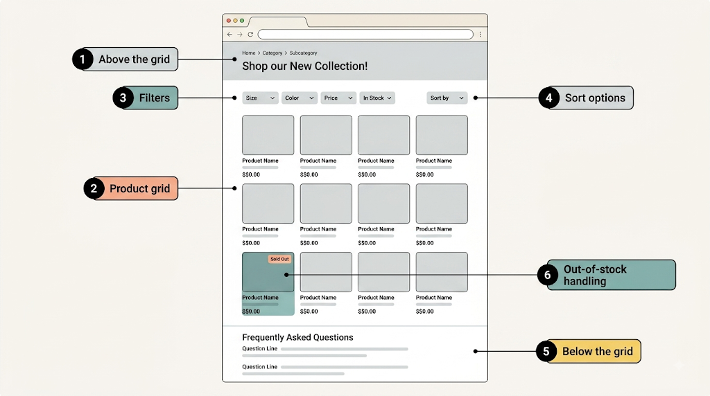
Walk through any collection page that's working well and you'll notice the same rough shape. A short line at the top tells you what you're looking at. Then a grid you can actually scan without squinting. Filters sit nearby but don't take over the screen. Sorting is there if you want it, mostly ignored if you don't. Below the grid, there's usually something for the shopper who scrolled the whole way down without buying: an FAQ, a buying guide, a reason to keep looking.
The one piece that separates a page that converts from one that just displays products is how it handles the products that aren't actually available. A grid full of "Sold Out" buttons in the first row is the fastest way to lose someone who came ready to buy.
Each of these gets its own section below, since "have good layout" isn't something you can actually act on.
Above the grid: intro copy, banner, breadcrumbs
The space above your product grid gets three jobs, and most stores try to make it do a fourth.
Job one is confirmation. A shopper who clicked "Running Shoes" needs one glance to know they're on the right page. A single sentence does this: what the category is, who it's for, maybe one thing that makes your version of it different.
Job two is navigation. Breadcrumbs (Home > Men > Shoes > Running) cost almost nothing to add and give shoppers an easy way back up a level instead of hitting the browser's back button. They also help Google understand your category hierarchy, which matters for how your site gets crawled and grouped.
Job three is orientation for shoppers who are further down the funnel and just want to see products. This is where the fourth job creeps in: stores load this space with a hero banner, a promo carousel, and three paragraphs of SEO copy before a single product appears. Keep this zone light with a short line. For example, wear-all-day, comfortable for running shoes, then go straight into the grid. That's the balance to aim for: one line of context, not a wall of copy, above the fold.
If you're deciding how much collection page copy to write and where it should sit, that's covered in more depth in our guide to category page content.
The grid itself: products per row, image consistency, badges
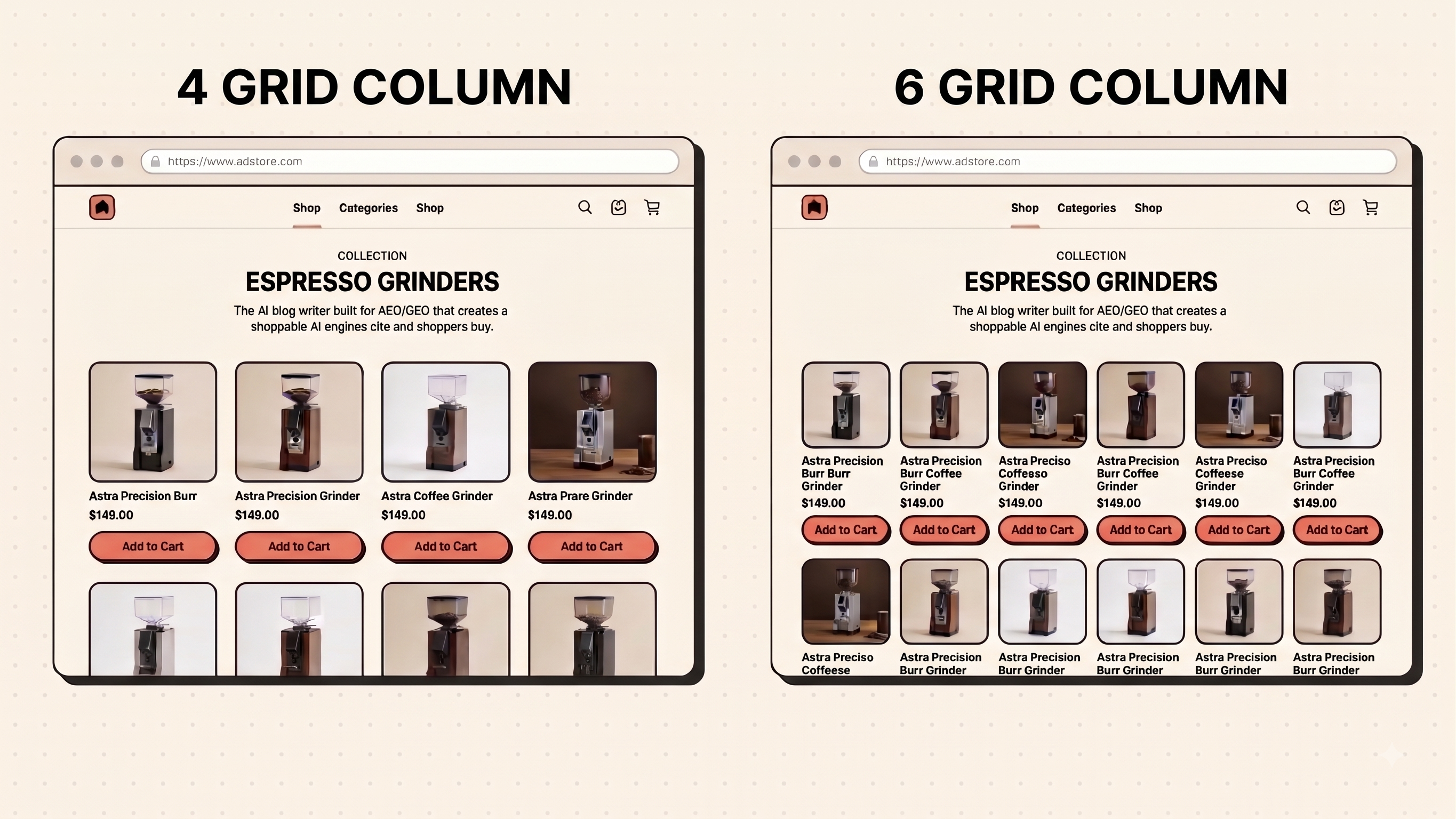
Shopify's own Dawn theme, the default starting point for a huge share of new stores, ships with 4 or 5 columns on desktop and 2 on mobile out of the box, adjustable through a simple slider in the theme editor. That default isn't an accident. Four products per row on desktop is wide enough to browse quickly and still large enough that product photography actually reads. Push past 5 or 6 to fit more in, and product cards shrink to the point where badges, prices, and titles start colliding.
A few things matter more than column count:
- Image consistency. Every product photo in a collection should use the same crop, background, and aspect ratio. One lifestyle shot next to nine white-background product shots reads as unfinished, even if each individual photo is good.
- Badge discipline. "New," "Bestseller," and "Low Stock" badges work when they're rare. A grid where half the products carry a badge trains shoppers to ignore all of them.
- Consistent card height. Product titles that wrap to two lines on some cards and one line on others break the visual rhythm of the row. Truncate long titles rather than letting the grid go ragged.
Pagination versus infinite scroll versus a "load more" button is a smaller decision than most guides make it. Pick one, keep the page count reasonable, and don't force a shopper to scroll through 200 products to reach page 2 of a filter result.
Filters and sorting: when they help and when they hurt
Filters help once a collection passes roughly 20 to 30 products, or once a category naturally splits by an attribute shoppers actually shop by, like size, color, price, or material.
Where filters commonly go wrong:
- Too many filter groups at once. Five or six filter categories, each collapsed, is fine. Twelve expanded by default pushes the actual products below the fold on mobile.
- Filter combinations that return zero results. If a shopper can select "Size 11" and "Color: Red" and land on an empty grid with no explanation, that's a dead end, not a filter.
- Sort defaulting to something unhelpful. "Alphabetical, A-Z" as a default sort order ignores merchandising entirely. Default to your actual best sellers or a manually curated order, and let shoppers opt into price or alphabetical if they want it.
On placement: left-hand sidebar filters work well on wide desktop layouts with dense catalogs. A horizontal filter bar above the grid works better for stores with fewer filter attributes, and it's the only option that translates cleanly to mobile without a separate design.
Below the grid: buying guidance, FAQ, internal links
This is the zone almost every store leaves empty, and it's a mistake, especially for categories where shoppers have real questions before buying: sizing, material, care, compatibility.
A store that runs an FAQ block below the product grid answering exactly the questions a shopper would still have after scrolling past every product, things like fit, sizing, or care instructions specific to that category. That content does two things at once. It answers real pre-purchase questions without cluttering the top of the page, and it gives Google (and AI answer engines increasingly summarizing category pages directly) something substantive to index beyond a list of product names and prices.
If a shopper scrolled this far without adding to cart, they're either comparing or they have a question your grid alone can't answer. A short FAQ, a buying guide link, or a "how to choose" section earns its place here far more than another banner would.
For collection-level conversion tactics beyond structure, our collection page CRO guide goes deeper into sort order and product card anatomy specifically.
Handling out-of-stock products
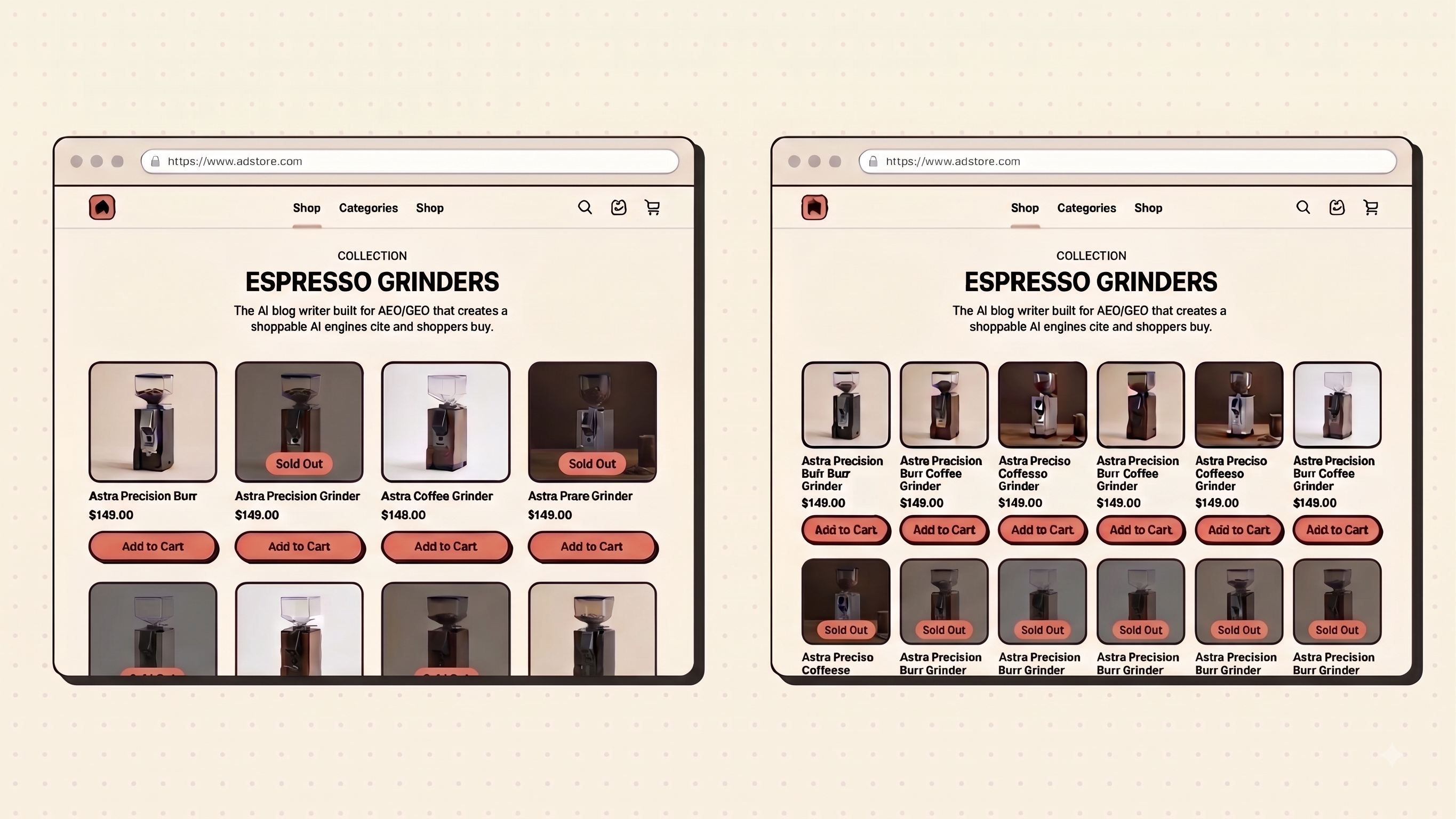
This is the one part of your collection page that breaks every day, quietly, without anyone noticing until a customer does.
A product sells out. It doesn't disappear from your grid. It stays exactly where it was, waiting for a shopper to click it and hit a wall. If that product was your bestseller, it's sitting in row one.
The shopper who came ready to buy taps it, sees "Sold Out," and leaves instead of scrolling back up to try something else. On a store with steady turnover, that happens dozens of times a week, across every collection.
What Shopify gives you natively:
- Settings > Products has a toggle to auto-sort out-of-stock items to the bottom of a collection
- It's free and worth turning on
- The catch: it only reorders products within the current page. A large, paginated collection can still show sold-out items on page one while in-stock items sit on page three
- Manually curated collections have no automatic fix at all, just dragging items down by hand, one collection at a time
Where that breaks down: the moment you have more than a handful of collections, or stock changes faster than someone can babysit it, the manual fix stops scaling.
Which is the whole reason RankCollections exists. It watches inventory continuously and removes dead-stock listings the moment a product sells out, across every collection at once. No theme code, nothing added to page load, since it runs entirely through Shopify's product API in the background.
It's not a replacement for deciding what belongs in a collection or how it should be merchandised. What it removes is the part that has nothing to do with strategy: catching every sold-out item before it costs a click, every day, on every collection, without someone remembering to check.
Best practice says push sold-out products to the bottom. RankCollections is what makes that practice hold up once you have more collections than you have time to babysit.
Create first 5 collections for free now.
Mobile layout
Most collection traffic is mobile, and mobile collection pages fail in a smaller, more specific set of ways than desktop ones do.
- Two columns, not one. A single column of products forces excessive scrolling and wastes horizontal space that's actually available even on a phone screen. Dawn's mobile default of 2 columns is the right baseline for most catalogs.
- Filters need a drawer, not a sidebar. A collapsible bottom sheet or slide-in drawer keeps filters accessible without permanently eating screen space.
- Sticky elements should be minimal. A sticky filter/sort bar at the top is useful. A sticky add-to-cart bar, a sticky promo banner, and a sticky filter bar stacked together push the actual products further down every single screen.
- Tap targets matter more than they look like they do. Product cards, filter chips, and the sort dropdown all need enough padding to tap accurately on a real thumb, not a cursor.
FAQ
How many products should be on a Shopify collection page?
There's no fixed number. What matters more is pagination: 16 to 24 products per page keeps load times fast and the grid scannable, with the rest reachable through pagination or a clearly labeled "load more."
Should I write SEO copy on every collection page?
Not every one, and not a wall of it. A short intro (2 to 4 sentences) above the grid is enough for search engines and shoppers alike. Save deeper content for the space below the grid where it won't push products off the first screen.
Do filters help or hurt SEO?
Filters can create thousands of near-duplicate URLs if every combination gets indexed. Use canonical tags on filtered URLs, and keep only genuinely distinct category variations, like a real "Men's Running Shoes" collection, indexable on their own.
What's the fastest fix for sold-out products hurting conversions?
Turn on Shopify's native "move out-of-stock to the bottom" setting first since it costs nothing. If your catalog is large or changes often, that setting's page-level limitation becomes a real problem worth solving with automation.
Takeaway
Layout decisions like these compound. A collection page that gets the grid, filters, and out-of-stock handling right converts noticeably better than one that just looks fine at first glance. If keeping every collection current and dead-link-free by hand is eating hours a week, RankCollections handles the out-of-stock cleanup and collection upkeep automatically, and the free plan is enough to try it on a handful of collections before deciding it's worth more.
Share this article